| This widget |
Provides this information
and actions |
Action Plan
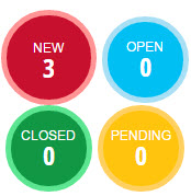 |
Four colored circles show the number
of action plans in each status. The size of the circles vary based
on the number of action plans. |
Closed Loop
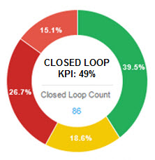 |
A color-coded circle graph
shows percentages of Closed Loops, and shows the KPI percentage
and count in the center of the circle. Hover over a colored section
to see a tip window that shows the number of Closed Loops
and their time frame. Click a colored section of
the graph, and the Closed Loop List report opens filtered
by the section you clicked. Click the widget title or
the blue count number inside the graph and the Closed Loop
List report opens showing all Closed Loop statuses. |
Closed Loop Efficiency
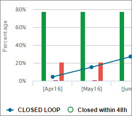 |
A line and bar graph in which
the bars show the monthly number and percentages of each Closed
Loop status, over a six-month period. The line graph indicates
the total number of Closed Loops generated for the month,
and includes all statuses. The left side of the graph
shows percentages, and the right side shows counts. To filter your view by status,
click a status icon from the row of icons at the bottom of
the graph. For example, click  for
Late . The bar graph displays Late Closed Loops. for
Late . The bar graph displays Late Closed Loops. Hover over each bar or point
of the line graph to see a tip window that shows the counts
and percentages of Closed Loops for each status. Click the widget title or
points in the line graph, and the Closed Loop List opens showing
Closed Loops in all statuses. Click a bar graph, and the
Closed Loop List shows Closed Loops corresponding to the status
of the bar you clicked. |
Customer Comments
 |
A list of prospects' comments
that include the customer name, date, and question number.
For detail, click the customer
name, and the Customer History report opens to the customer
you selected. |
Heatmap
 |
A rectangular box graph that
shows different sized boxes for organizations, based on the
number of surveys they conducted. The boxes are color-coded
green or red, based on whether the organization is above or
below the average of the organizational level directly above
it. Hover over a box to see the
organization name and survey count. To see a further breakdown
of surveys in a specific box, click the box. To return to
the previous view, click Reset.
For example, if the Heatmap for Region
1 shows boxes for two districts, click a district to see boxes
representing the dealers in the district. If you click a dealer
box, the Organization Summary page opens to the dealer you clicked.
|
Key Performance
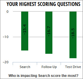 |
Color-coded
bar graphs show the three highest and the three lowest scoring
questions based on your selection of either the Prospect,
Purchase, or Service Key Performance widget. Scores are based on key drivers
for each program. Below the highest and the
lowest scoring question graphs are the names of the two organizations
that are affecting your score the most (Not shown in the graphic.).
Click on the blue score number
next to the organization's name, and the Organization Summary
report opens, showing the organization you selected. |
Opportunities

|
A color-coded circle graph
shows numbers for New, In Progress, and Late opportunities.
Hover your mouse over any
of the colored segments in the circle to see a tip window
that shows the count for that status. Click the Total Opportunities number
in the center, and the Opportunities List opens, listing all
the opportunities, including those in Closed status. Below the circle is a list
of organizations, with three columns showing numbers in blue
of New, In Progress, and Late opportunities. Click on a blue
number and the Opportunities List report opens, sorted by
the opportunity status you clicked. |
Overall Prospect Driver
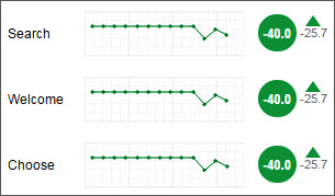 |
A list of key purchase drivers
are shown with color-coded
line graphs, showing performance for the last 13 months. A
blue graph indicates no scores are available for comparison.
Hover your mouse over points
on the line graph to see scores for each month. The overall or dealer's score
for each key driver is shown in the circle at the right end
of the graph The small gray number under
the arrow shows the difference between the current and the
previous time period. A red down arrow, green up
arrow, or amber bar indicates if the change from the previous
time period was higher, lower, or remained the same. Click the widget title or
score and the Survey List report opens. |
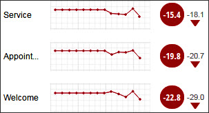
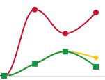
Overall Purchase Driver
 (partial graphic)
 |
A list of key purchase drivers
are shown with color-coded
line graphs, showing performance for the last 13 months. A
blue graph indicates no scores are available for comparison.
Hover your mouse over points
on the line graph to see scores for each month. The overall or dealer's score
for each key driver is shown in the circle at the right end
of the graph The small gray number under
the arrow shows the difference between the current and the
previous time period. Ared down arrow, green up
arrow, or amber bar indicates if the change from the previous
time period was higher, lower, or remained the same. Click the widget title or
score and the Survey List report opens. |
Overall Service Driver
 (partial graphic)
 |
A list of key purchase drivers
are shown with color-coded
line graphs, showing performance for the last 13 months. A
blue graph indicates no scores are available for comparison.
Hover your mouse over points
on the line graph to see scores for each month. The overall or dealer's score
for each key driver is shown in the circle at the right end
of the graph The small gray number under
the arrow shows the difference between the current and the
previous time period. A red down arrow, green up
arrow, or amber bar indicates if the change from the previous
time period was higher, lower, or remained the same. Click the widget title or
score and the Survey List report opens. |
Performance Trend for Overall
Tab
 |
A line graph that displays
a color-coded line for Overall, and a line for each program's
performance for the current month and each of the previous
12-months. Tabs for Detractors  , Passive , Passive  ,
and Recommenders ,
and Recommenders provide filters for
score detail for all programs. provide filters for
score detail for all programs. Hover over a point on the
graph to see a tip window that shows percentages, based on
the tab you selected.
|
Performance Trend for Program
tabs
 |
A line graph that shows color-coded lines for Detractors,
Passives, and Recommenders. The graph shows the current
month and each of the previous 12-months. Tabs for Key Drivers provide
filters for score detail. Hover over a point on the
graph to see a tip window that shows percentages for Detractors,
Passives, and Recommenders, based on the tab you selected.
Click the widget title or
a point on the graph and a Performance Trend report opens. |
Portal Traffic
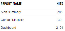 |
|
Prospect Summary
 |
A decision tree graph that
shows customer responses based on different survey questions
and probe questions. The top level shows prospects,
then branches and shows percentages of prospects who have
placed an order and those who did not place an order. The
tree continues to branch, showing the percentages of other
choices. Click a See Comments link
and the Survey List report opens, sorted by the comments.
|
Recent Comments  |
A customer comment selected
at random from the most recent day. The comment changes every
15 seconds. To see the full comment, hover
your mouse over the speech bubble icon. To view information on the
customer, click the customer name and the Customer History
report opens to the customer you selected. |
Recently Added Surveys
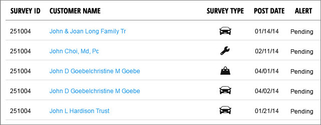 |
Shows a list of the most recently
added surveys. Symbols indicate each survey's
source: Prospect  ,
Purchase ,
Purchase  ,
or Service ,
or Service  ,
based on your programs. ,
based on your programs. Click the customer name, and
the Customer History report opens to the customer you selected. |
Retailer Performance -
3 options
Prospect Purchase
Prospect Service
Purchase Service
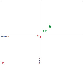 |
Shows dealer information based
on your selection of two questionnaires. CRS scores from the two questionnaires
are shown in the graph. For example, if you select Purchase-Service
Retailer Performance, CRS Purchase scores are represented
on the X axis or horizontal line. CRS Service scores are represented
on the Y axis or vertical line. CRS scores on the horizontal
line increase towards the right, from -100 to + 100. Scores
on the vertical line increase from bottom to top. Dealer's are shown as color-coded
dots on the graph, based on their scores. Dots in the upper
right quadrant are green, dots in the lower left quadrant
are red, and dots in the upper left and lower right are amber.
Hover over a dot to see the
scores, and click a dot to see the dealer information on the
Organization Summary report. |
Sentiment Analysis
 |
Shows keywords and counts
for the number of times a word appears in customer comments.
The words are color-coded
in red, yellow, and green to indicate the type of comment; Detractor,
Passive, or Recommender. Click a number next to one
of the words, and the Comment List report opens sorted by
the word you selected. |
Top/Bottom Performers
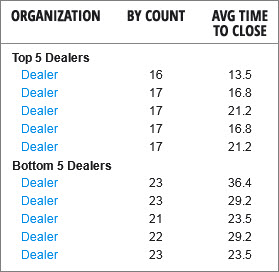 |
Shows the top five and bottom
five dealers based on the number of Closed Loops It also shows
the average time to resolve Closed Loops for each dealer.
For detail, click a dealer's
name, and the Organization Summary report opens, showing the
dealer you selected. |
Year Over Year
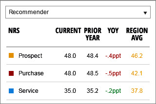 |
Shows key drivers' scores
for the current year and prior year, with the difference shown
in the YOY column. Provides filter for All, Detractors,
Passives, and Recommenders. Based on your hierarchy selection,
color-coded scores are shown
for one region above yours. |
 To conserve
space, many of the graphics in the This
widget column are partial graphics.
To conserve
space, many of the graphics in the This
widget column are partial graphics.